
Online Documentation for SQL Manager for DB2
Quick Code
The Quick Code section of the Editor Options dialog allows you to specify the automatic features, fonts, styles, foreground and background colors, borders and other attributes of the text used by the editor to display objects for 'quick code': tables, functions, indexes, fields, procedures, defaults, views, sequences, triggers, schemas, tablespaces, aliases, servers, MQ tables, UDS types, wrappers, nicknames, SQL keywords, SQL functions.
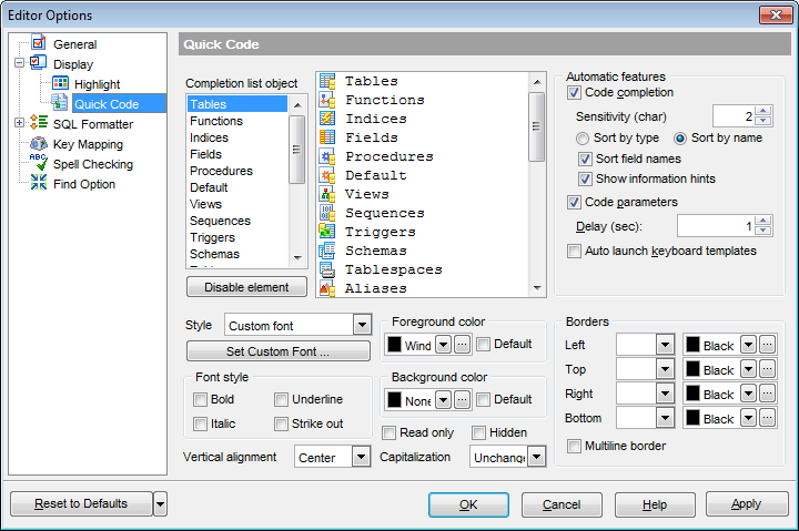
The Completion list object list contains all objects for which you can set quick code parameters. For your convenience the preview area (located to the right of the Completion list object list) illustrates the changes being made to each of the objects.
If you click the Disable element button, the standard settings will be applied to this object; the button text will change to Enable element. If you press this button, you will be able to change font and color attributes for this object.
Controls for changing the properties of the item selected in the Completion list object list are located below. Use the following instructions for each of the objects.
 Code completion
If this option is checked, then on typing the first word characters in the SQL text editor you will be offered some variants for the word completion in a popup list (an analogue of the Code Insight feature in Delphi IDE). The popup list will appear after a period of time defined by the Delay option.
Sensitivity
This option allows you to set the number of characters to be typed before code completion is activated.
Specify whether items of the code completion list should be sorted  by type or by name, and check the Sort field names option to apply sorting for field names as well.
Show information hints
This option enables/disables information hints.
Code parameters
If this option is checked, the Delphi-like hint for key words is enabled.
Delay
Using this option you can change the time after which completion variants popup.
Auto launch keyboard templates
Allows you to use keyboard templates for faster typing frequently used expressions (see Keyboard Templates).
Select the style to be applied to the words inserted automatically (Custom font, Font style and colors, Back and foreground or Background only). Then, depending on the style selection, set custom font, Font style, Foreground color, Background color, Borders.
Use the Style drop-down list to choose the parameter to change.
You can define the font type, size and style for the selected element by pressing the Set custom font... button.
There is also a possibility to set the font style in the Font style group:
Bold
Italic
Underline
Strike out
Vertical alignment
Allows you to set the vertical alignment of the words inserted automatically. Possible values are:
Top
Center
Bottom
Capitalization
Allows you to change the case of the words inserted automatically. Possible values are:
Unchanged
Upper case
Lower case
Toggle case (all letters except the first one are in the upper case)
Initial caps (the first letter is in the upper case, others are in the lower case)
Select the text foreground/background colors from the Foreground color / Background color drop-down lists. If you check the Default box, the default color will be applied.
Read only
Specifies that the selected element cannot be altered.
Hidden
Specifies that the element will be displayed only when placing a cursor over them.
Use the Capitalization drop-down list to choose the case for the selected element:
Unchanged
Upper case
Lower case
Toggle case (all letters except the first one are in the upper case)
Initial caps (the first letter is in the upper case, others are in the lower case)
In the Borders group you can set border properties for the selected element:
Left
Top
Right
Bottom
Use the first drop-down list for each border to choose the border line type; then use the second list to choose the border color.
Multiline border
Specifies that the line will be displayed at the beginning and at the end of the line.
Note: When setting colors, select an item from the drop-down list or click the ellipsis  button to select a color using the Color dialog where you can specify the required color from the palette.
|
See also: |


