
Online Documentation for SQL Manager for DB2
Highlight
The Highlight section of the Editor Options dialog allows you to specify the fonts, styles, foreground and background colors, borders and other attributes of the text used by the editor to mark out various text fragments: string, number, SQL keyword, symbol, comment, identifier link, highlighted link, table alias, SQL datatype, SQL variable, SQL function, wrong symbol, exception, parenthesis match, current line, selected text, search mark.
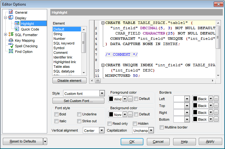
The Element list contains all elements available in SQL editors of the program. For your convenience the preview area (located to the right of the Element list) illustrates the changes being made to each of the elements.
If you click the Disable element button, the standard settings will be applied to this element; the button text will change to Enable element. If you press this button, you will be able to change font and color attributes for this element.
Controls for changing the properties of the item selected in the Element list are located below. Use the following instructions for each of the elements.
Use the Style drop-down list to choose the parameter to change.
You can define the font type, size and style for the selected element by pressing the Set custom font... button.
There is also a possibility to set the font style in the Font style group:
Bold
Italic
Underline
Strike out
Vertical alignment
Allows you to set the vertical alignment of the key words. Possible values are:
Top
Center
Bottom
Capitalization
Allows you to change the case of the key words. Possible values are:
Unchanged
Upper case
Lower case
Toggle case (all letters except the first one are in the upper case)
Initial caps (the first letter is in the upper case, others are in the lower case)
Select the text foreground/background colors from the Foreground color / Background color drop-down lists. If you check the  Default box, the default color will be applied.
Read only
Specifies that the selected element cannot be altered.
Hidden
Specifies that the element will be displayed only when placing a cursor over them.
In the Borders group you can set border properties for the selected element:
Left
Top
Right
Bottom
Use the first drop-down list for each border to choose the border line type; then use the second list to choose the border color.
Multiline border
Specifies that the line will be displayed at the beginning and at the end of the line.
Note: When setting colors, select an item from the drop-down list or click the ellipsis  button to select a color using the Color dialog where you can specify the required color from the palette.
|
See also: |


