
Online Documentation for DB Comparer for PostgreSQL
Check boxes
Use the Check boxes section of the Visual options dialog to customize the border style and the appearance of check boxes and radio buttons.
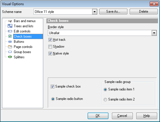
Border style
This setting determines the manner in which check box and radio group borders are painted. Use the drop-down list to select the painting style that will be applied to the check boxes and radio groups:
None
Single
Thick
Flat
3D
UltraFlat
 Hot track
This option specifies whether the check box is highlighted when the mouse cursor is positioned over it. Select this option to highlight an edit control in response to mouse movements.
Shadow
If this option is selected, a shadow is displayed for the check boxes and radio groups.
Native style
This option determines whether the native Windows style will be applied to the check boxes and radio buttons.
The option has the highest priority for check boxes and radio buttons. If this option is selected, the check boxes and radio buttons are painted according to the native Windows style, regardless of other painting settings.
Note: The Native style option is currently supported for the Windows® XP operating system only.


