
Online Documentation for Data Generator for Oracle
Page controls
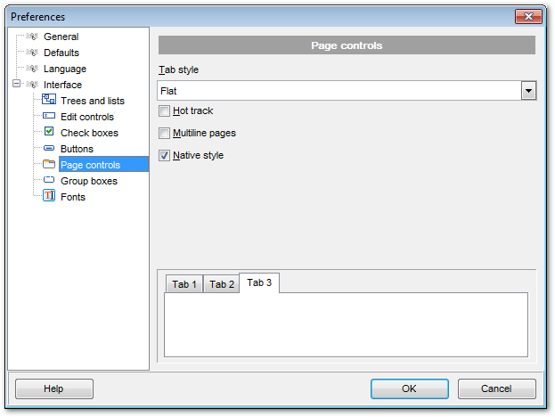
Use the Page controls section of the Preferences dialog to customize the style of all Data Generator page controls.
Tabs are visual elements of tab controls. Their purpose is to identify pages and switch between them. Once a tab is clicked, the corresponding page is selected.
Pages are container controls that represent the contents of tab controls. Tab controls contain a single page, whose context is to be updated each time the selected tab changes. Page controls contain the number of pages equal to the number of tabs.
Tab style
Use the drop-down list to select the painting style that will be applied to the tab controls:
Tabs (tabs are painted as notebook tabs)
Buttons (the selected tab is painted as a pressed button, other tabs are painted as released buttons)
Flat (tabs are painted as notebook tabs, but appear lowered slightly)
 Hot track
This option specifies whether tab captions are highlighted when the mouse pointer hovers over tabs. Select this option to enable tab highlighting.
Multiline pages
This option specifies whether tabs are arranged across several rows.
If this option is enabled, tabs are automatically arranged into the minimum number of rows required to fit all of them. If this option is disabled, tabs are displayed within a single row.
Native style
This option determines whether the native Windows style will be applied to the tab controls.
The option has the highest priority for the tab controls. If this option is selected, the tabs are painted according to the native Windows style, regardless of other painting settings.
Note: The Native style option is currently supported for the Windows® XP operating system only.


